

We’ve all been spending more time online, especially during the past two years. You may have noticed that web aesthetics trends are taking cues from the early internet era.
Designers are sticking to classic website design principles, but they’re also going beyond standard website aesthetics — with a new spin on grids and lines, typography, and more. They use a lot of sophisticated textures, muted colors, and serif fonts, which is why websites don’t end up feeling too retro.
Futuristic web design also includes pretty innovative contemporary techniques such as advanced animations and interactions, together with visual effects — including grain and glassmorphism. Designers can do all this way easier and faster than ever before thanks to numerous available no-code tools.
Keep reading to learn about emerging website aesthetic trends in 2024, or use the links below to jump ahead.
- What is Website Aesthetic?
- What’s New For Sites?
- Trending Web Aesthetic Colors & Themes
- Interactivity & Movement Website Aesthetics
- Website Aesthetics for Effects & Textures
- Inclusive Design Website Aesthetics
- 5 Aesthetic Website Examples
- Bottom Line: Power Your Website With Fully Managed Hosting
What is Website Aesthetic?
In web design, website aesthetic refers to the look and feel of the front end of a website or web application. Website aesthetic can be based on elements such as white space, color scheme, font, alignment, navigation, menus, imagery, interactivity, and more.
What’s New For Sites?
An overarching trend in 2024’s website aesthetics is an increased sense of creativity, imagination, and playfulness. Website design services are now creating sites as interactive projects, art, or simply to delight visitors. Here are some of the top trending website aesthetics you’ll see.
Trending Web Aesthetic Colors & Themes
1. Black & White
Already, it seems like one of the main website aesthetics trends is simple, clear, and plain. In other words, minimalistic characteristics are pushing busy websites to the side.
You’ll notice more and more sites with sophisticated effects and sleekness — it’s a smoother, less crowded, and more refined browsing experience. Black and white are a perfect combination to create a classy, yet intriguing, website.
2. Pop of Vivid Color
One of the reasons behind the minimalistic approach is that visitors won’t wait around for all your images, content, and slow-loading designs to load. Even though black and white can give you a sophisticated and minimalistic look, one of the best ways to get a “striking but simple” design is to include a pop of color.
For instance, go with earthy tones. Consider applying a combination of basic primary colors and nature-inspired tones. Or, consider red.
One of the colors you’ll be definitely seeing more of is red. People used to avoid red, since it can be hard on the eyes. But, similar to red lipstick, a red accent can be both subtle and striking enough to grab the user’s attention. If you experiment with tones and shades, you can easily incorporate red in unique ways that won’t look overwhelming.
3. Neo-Brutalism Theming
This is a theme with roots in an architectural movement of the 1950s–70s called brutalism, which used raw, exposed materials such as concrete. This movement has been getting more and more popular since it reappeared in the digital world in 2014, as documented on brutalistwebsites.com. It uses plain backgrounds, asymmetrical layouts, barebones unstyled HTML, and untreated photos.

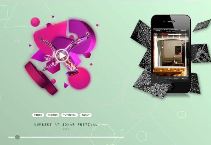
4. Engaging Interactives
Many web designers are going back to large-scale animated interactions and bringing them to a whole new level in 2024. Such interactions go beyond scrolling to encourage visitors to engage with the page in a way they click, drag, and swipe the elements. This way, users can feel more investigative, since they actively dig through the page to uncover content.

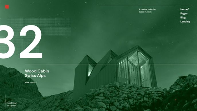
5. Typographic Hero Images
Since the hero image is the first thing users see when coming to your website, you have to use something that will be presented in a simple way, but will also make a powerful statement.

Interactivity & Movement Website Aesthetics
6. Typefaces & Typography
Typography has evolved as well — the strict rules web designers once followed have given way to the mixing of fonts with photos, emojis, and different shapes. For instance, bold design is a trend for 2024 as well as typography of unusual size. When they get to a certain size, words are not just copy anymore — they become an engaging graphic element that represents your site.
Use your imagination, but carefully — something eccentric might create an eye-catching effect, but can also easily turn into irritating and unreadable graphics.
Another emerging website aesthetic is interactive fonts, where text moves and plays with the visitor’s mouse. A simple way to achieve this is to apply a hover-state change the same you’d do with a button.
It used to be harder to create this effect, since you had to write such interactions by hand, whereas today you can do it by using modern no-code platforms. However, when it comes to interactive fonts, keep in mind some users can get easily distracted by characters that move.

7. Scrolling Elements
Another emerging web aesthetic trend is horizontal scrolling. Designers didn’t start with it to stand out — it was simply an easier way to present the secondary information on the site. Horizontal scrolling looks like you’re going through the gallery and seeing the exposed content step by step as you scroll. Many users are still not used to it, which is why traditional (vertical) scrolling works just as well.

Website Aesthetics for Effects & Textures
8. 3D Illustrations
3D illustrations are an extremely popular website aesthetic trend. One of the coolest examples are 2D/3D mashups. The 2D design plays on old illustration styles, and the 3D spin makes it more interesting, eye-catchy, and life-like. An additional subtrend here is a 3D environment, where cutout 3D imitates a collage of 2D cutouts.

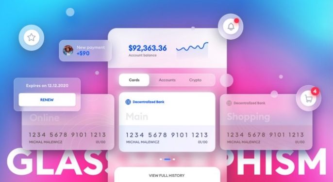
9. Glassmorphism
Glassmorphism is another website aesthetics trend that’s growing in popularity. It’s a UI design that emphasizes dark or light objects located on top of colorful backgrounds. Designers place a background blur on the objects, which is why the background shines through and eventually results in this frosted-glass effect. This is something that establishes verticality. It also emphasizes the depth of the design. Also, what’s cool about glassmorphism is that it looks like objects are floating in 3D space because they are blurred.

Inclusive Design Website Aesthetics
10. Cause-Based Elements
Many businesses tend to create their marketing campaigns and websites as if they were their own end-user. Since that’s almost never the case, many are paying more attention to inclusive design to ensure they don’t overlook the concerns or needs of certain groups that might visit their site.
Many websites are expanding their media, messaging, and design to account for a wider audience made up of various backgrounds including socio-economic classes, different age groups, sexual orientations, etc. For instance, the color blue is used for autism awareness, or rainbows for Pride Month.
11. Increased Accessibility Options
At its core, the web is designed for all people, whatever their location, language, hardware, software, or ability. The web generally removes barriers to interaction and communication many people with disabilities face in the real world. However, some apps, technologies, websites, or tools are not designed for a diverse range of movement, hearing, sight, or cognitive ability. That’s where accessibility comes in.
Accessibility is one of the vital factors for both companies and developers that want to create high-quality tools and sites, without excluding certain groups of people from using their services and products.
Choose a CMS that supports accessibility: When creating your site, use a content management system (CMS) that supports web accessibility. Make sure the themes, widgets, page layouts, plugins, and the rest of the factors of your site are compatible with web accessibility standards like WCAG 2.0.
Use more headers: When used properly, headers are a great tool you can structure and organize your content. With them, you allow your visitors to easily navigate through your website. This also boosts your SEO score, which means it will be easier for you to get more organic traffic.
Use alt tags for images: Even though images generally provide great value to users, they can also be a barrier for visitors with impaired or limited vision. Therefore, if you assign alt tags, your images will have a description that helps users to understand them using a screen reader. Alt tags also improve your SEO score.
Note: Be Careful With Colors
Colors can help a visitor differentiate the information on your website. Still, color blindness or other disabilities can make it difficult for users to find information, call-to-action buttons, or other elements when developers don’t pay enough attention to proper color contrasts. You can check the contrast of colors on your website simply by adding the Google Chrome extension.
5 Aesthetic Website Examples
1. Method

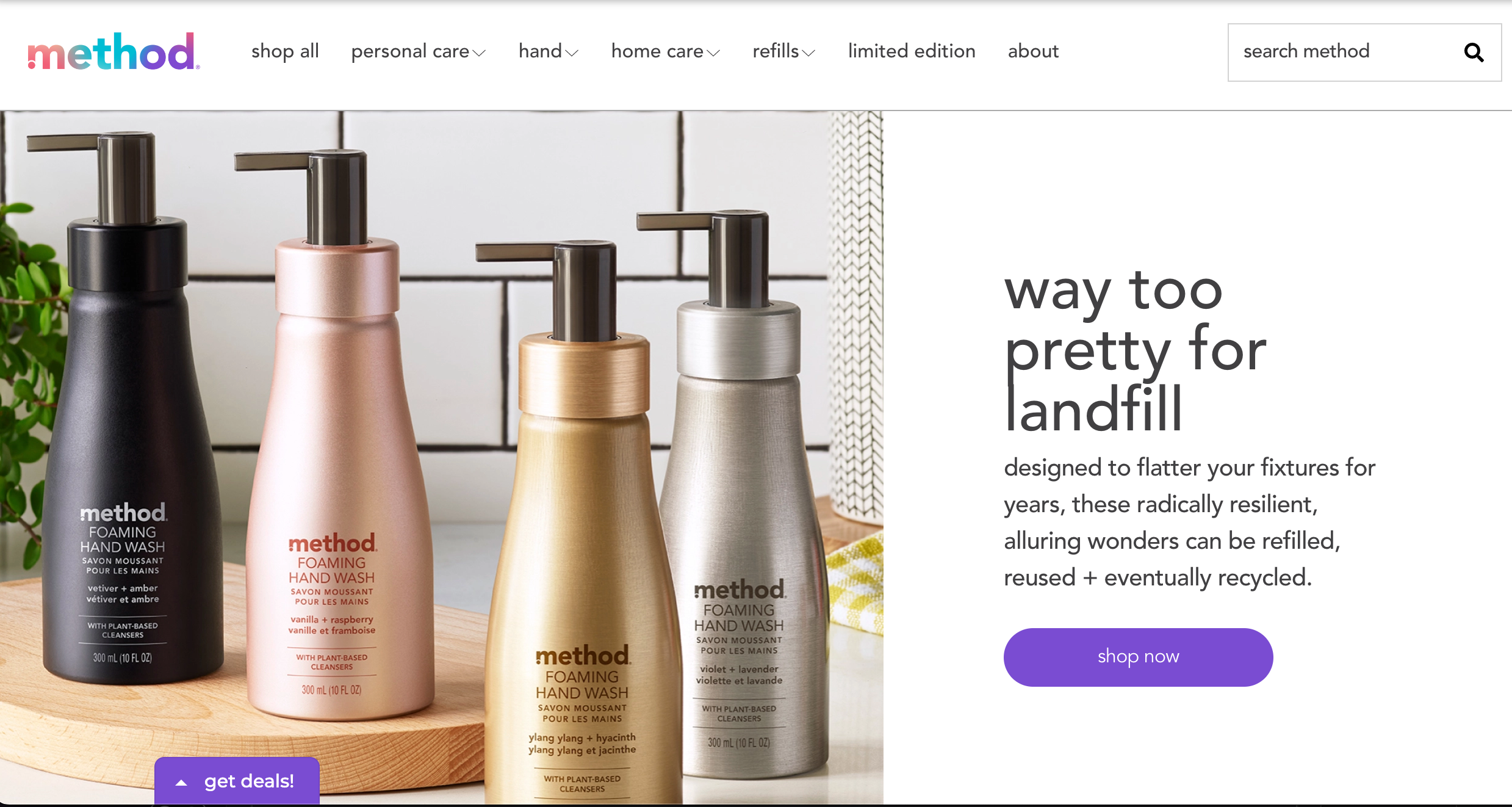
The Method website kept it clean. Utilizing black and white with some pops of color produced an uncomplicated, classic design that doesn't overwhelm the viewer. The only imagery, four products in metallic colors that match bathroom fixtures, are set against a white tile background as well. The gentle, earthy tones paired with sparse decor evoke the brand's organized and tidy persona.
2. Brooklyn Brewery

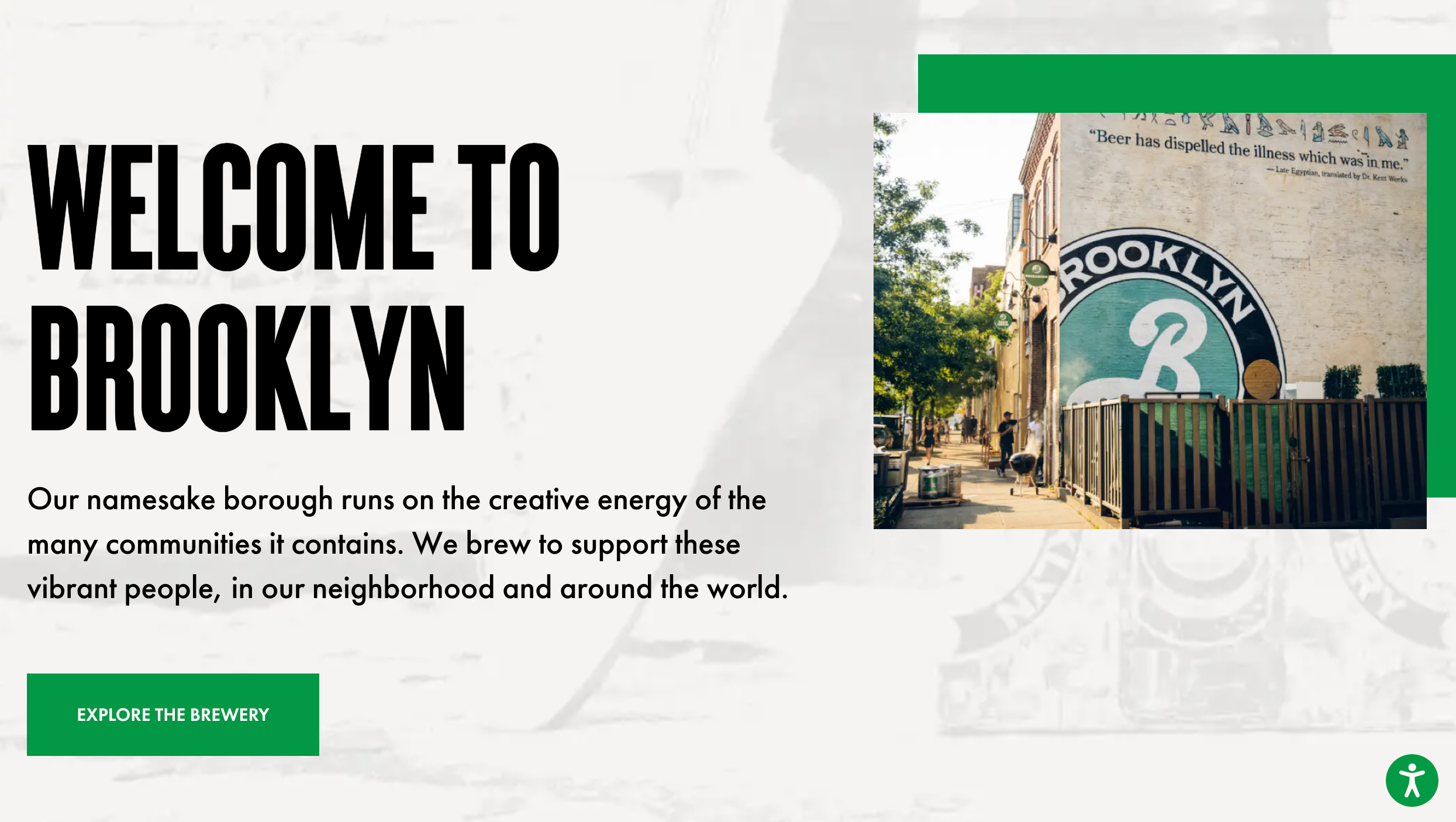
When you're a business named after an iconic city, you better make sure your design does it justice. Brooklyn Brewery understood the assignment. The simple but engaging design includes scrolling elements and as well as interactivity. Hints of an opaque logo lurk in the background, while sliding images appear as you scroll down the page. Accessibility options are clearly labeled giving a smooth, engaging experience to everyone.
3. Academy Self Defense

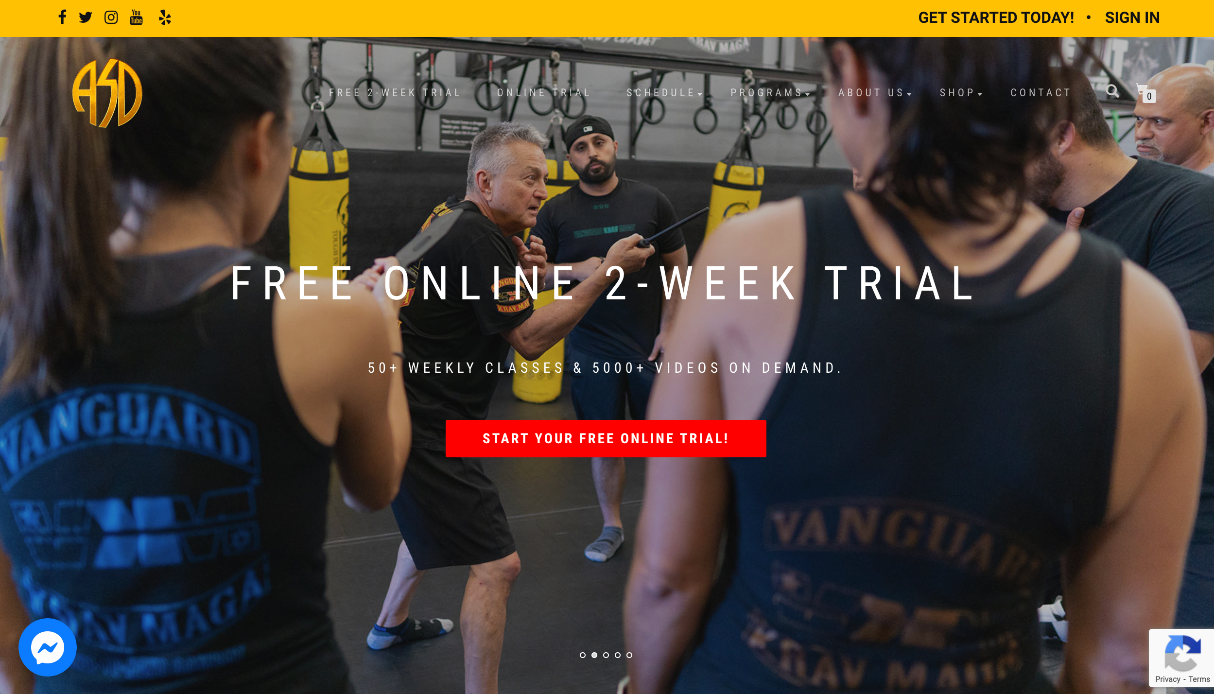
Websites promoting activity need to reflect motion, and that's just what Academy Self Defense's website did. Five images of people practicing martial arts scroll across the screen, showing different age levels and styles. The website also keeps a consistent color scheme – the uniforms and equipment in the pictures are reflected in the site design. Support and privacy options remain on screen as you scroll.
4. The Pioneer Woman

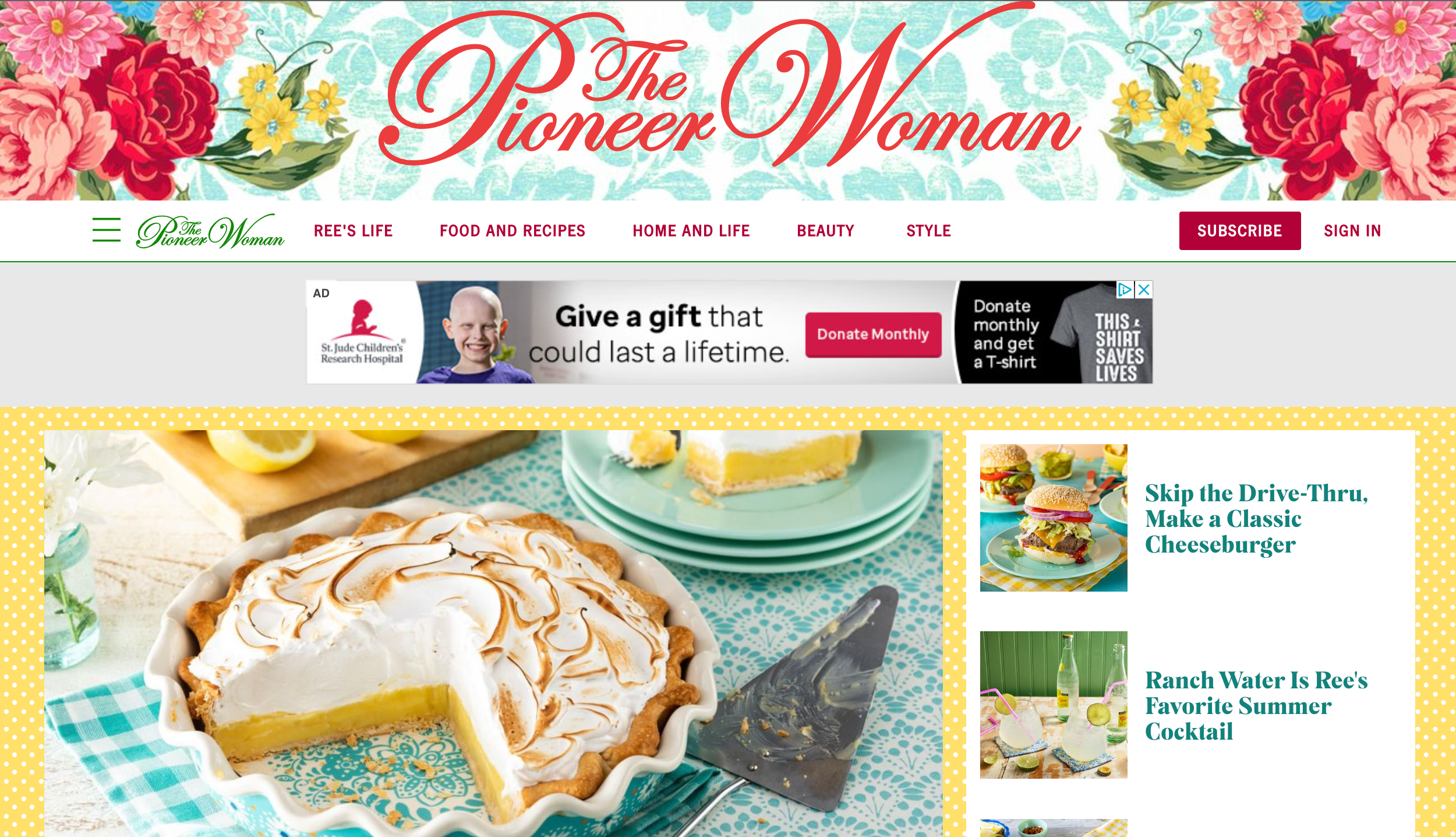
If you've ever watched Ree Drummond's cooking shows, you'd know how full of life and color her home is. Her website is no different. Her header image displays flowers over a washed out blue floral pattern. The site gets a yellow polka dot background that is highlighted with muted reds and teal. The Pioneer Woman website feels like its been draped with your mom's favorite tablecloth and invites you to sit for some cake and coffee. It's warm, bright, and fun. The look and feel fit right in with Ree's kitchen, making the deviation from more minimalist designs that are on trend right now very successful.
5. City University of New York

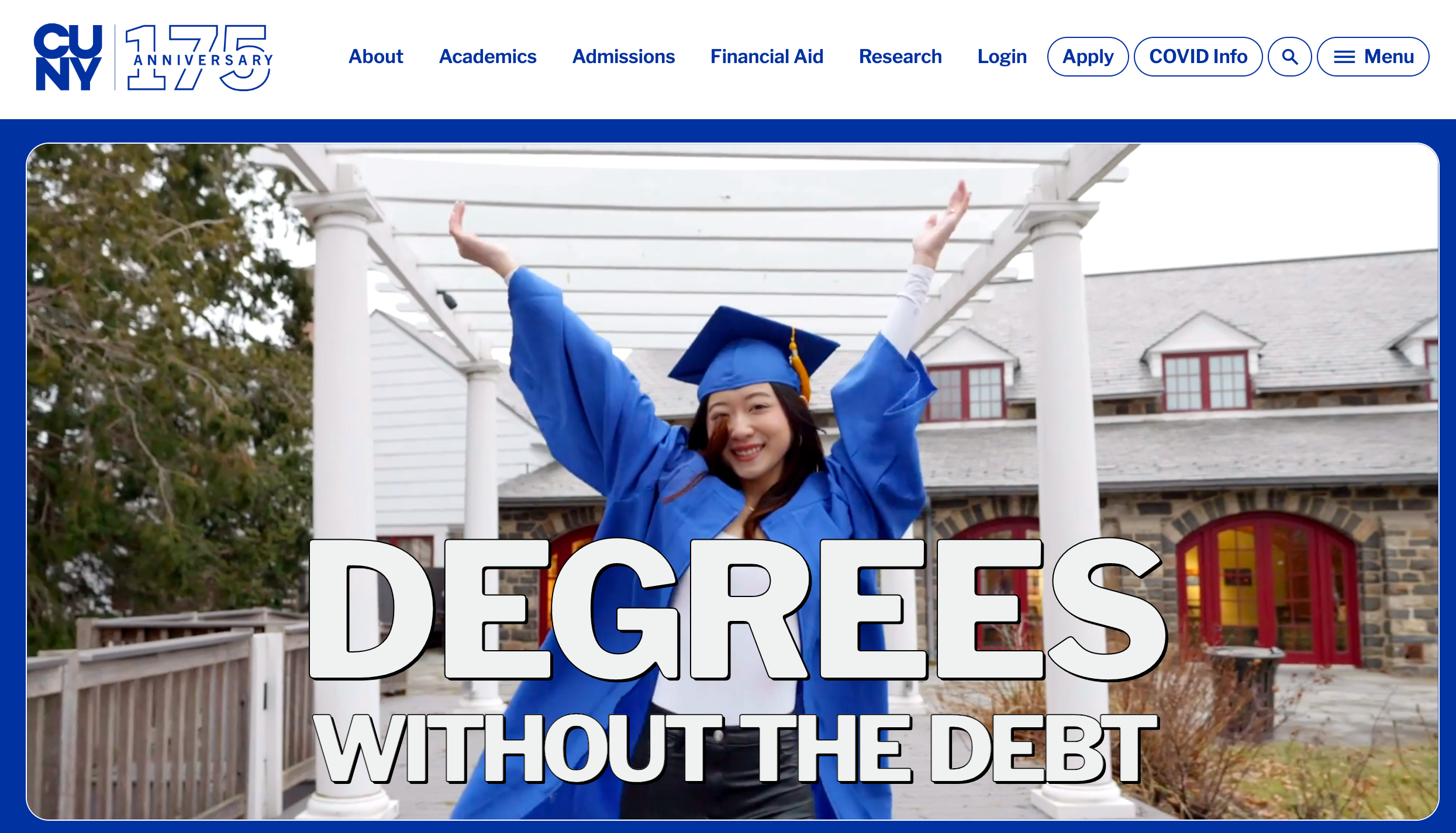
CUNY is the largest university system in New York City and has roughly 250,000 students in its network. The CUNY website feels just as big as its student body. When you navigate to the site, you see a giant video that changes between a dozen or so graduates of different ages, backgrounds, and disciplines. "Degrees without the debt," it says in big bold lettering. The rest of the site looks like WordPress templates you've come across before, but the utilization of movement and video engages the viewer and makes you keep looking.
Bottom Line: Power Your Website With Fully Managed Hosting
What’s great about website aesthetics trends in 2024 is that there are many different practices you can combine together that will easily overlap and work just great.
To be creative and follow modern website design trends, you need proper tools and enough space where you can let your imagination run wild. A scalable plan, for instance, can get you more space as your website grows -— which is one of the things that make managed hosting solutions such a great choice.
In other words ��— when you have someone that will take care of the technical aspect of your website, it’s way easier to dedicate all your resources to create engaging, intriguing, and eye-catching content that will stand out in the crowd.
Check out fully managed WordPress and WooCommerce hosting plans to get started today.

