The secret to designing the best website is to keep it simple. After all, one of the most essential web design principles is the balance between aesthetics and functionality. When designers emphasize design for design's sake, sites can be attractive yet difficult to use.
Think of designing websites like building a store location for your business. The outside of the building could be beautiful, but if no one can tell where the entrance is, the design isn't effective.
The following eight web design principles will help you combine design, content, and functionality into a top-converting web design.
1. Know Your Purpose
What's the purpose of your website? Knowing the end goal will help you make the right design choices to increase your chances of converting visitors. For example, if you're trying to create an ecommerce website, the purpose of your website is to sell products. Therefore, your design should highlight your products. And, the functionality of buying and checking out must be simple.
Landing pages are a great example of purpose influencing design. Many designers recommend removing the site navigation from landing pages for things like a free trial or eBook download. The purpose of those pages is to collect users' information. You don't want the visitor to start clicking around and reading the history section on your About Us page. Placing a form above the fold and eliminating the navigation are just two ways to design around the page's purpose.
It's a fact: beautiful stores sell more
Get a one-of-a-kind WordPress website at a one-time price
2. Create a Visual Hierarchy
Visual hierarchy guides readers through processing your website's content and visual elements. It's crucial when you're creating a homepage. If everything's the same size, visitors can tell what's important. Using larger images and font sizes helps create a hierarchy so visitors will gravitate toward the most important information first.
You can use different fonts, type sizes, colors, backgrounds, and images to create visual interest and hierarchy. Researchers have found most people process web pages in an F or Z layout.
The F layout accounts for reading the information across the top of the page, then scrolling down to look at bullets or major headings, and then back to read across in more detail.
A Z layout reads left to right across the top, then scrolls through the middle of the page before reading left to right across the bottom. You can use design elements to lead a reader's eyes through the steps naturally.
3. Use Simple, Clean Fonts and Colors
Colors and fonts are essential but often overlooked web design principles. They should match the overall appearance of your brand. When selecting your typography and color palette, try to create simplicity. For fonts, try to stick to three or fewer. Use one for headings, one for body text, and a third for accents.
For colors, modern web design is often monochromatic, which means it uses a single color. If you use multiple colors, try to pick one dominant color and two to four accent colors.
Using too many color combinations and fonts makes a website look chaotic and unprofessional.

The color and typography on this site combine to create a clean look. Source: shop.lululemon.com
4. Publish Quality Content
Content is an essential part of what makes a good website design. Design and content go hand in hand. Your site's design captures people's attention. The content will keep them on the site long enough to make a purchase or fill out a form.
When you start to create a homepage or any page on your website, identify the main message for the page. What information do you want a visitor to take away from the page? What action do you want them to take on the page? Plan the design and content around the key takeaway or action.
Also, be sure to incorporate the latest search engine optimization best practices into your design and content. Some of the same website tips for design apply to creating SEO-friendly content. You'll want to make your web pages easy for humans and search engines to read.
Make your content more readable by including:
- Headings
- Small digestible paragraphs
- Bulleted lists
- Relevant images
5. Embrace Whitespace
Whitespace is your friend. Whitespace is the empty space around design elements and blocks of text. The space doesn't have to be white. It could be the color of the background of your page. Many people make the mistake of cramming every pixel of their page with text or an image. But you're better off giving elements space to breathe.
Using blank space minimizes noise, helps images stand out, and makes content more digestible.

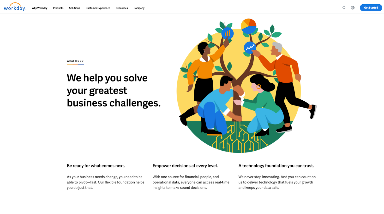
The use of white space on this page draws your attention to the headline and unique image. Source: Workday.com
6. Use Quality Imagery
The quality and tone of your images need to match your design. Be careful when utilizing stock photography. Stock photos can be cheesy and look unprofessional. Consider hiring a professional photographer to take shots of your team, products, or locations for authentic-looking photos.
7. Keep the Navigation Simple
Navigating a website should be intuitive. As a general rule, try to make sure everything a visitor could look for is within three clicks of your homepage.
Another way to test the user-friendliness of website navigation is to try to give instructions on how to find something on the site. Customer service agents and assistants often have to coach customers on how to find something on a website. If the instructions include several steps or are hard to follow, rethink your navigation. For the ultimate simplicity, consider how to create a one-page website.

Tesla’s navigation is simple and doesn’t require clicking through a myriad of dropdowns. Source: Tesla.com
8. Design for Every Screen
What makes a great website is ensuring your website is accessible to everyone. Therefore, you’ll want to design for screens of all sizes: projections, desktop, tablet, and mobile. If you look at the top 10 ecommerce sites, you'll notice they're all optimized for mobile. This is because mobile accounts for the majority of online shopping and is one of the major ecommerce trends.
Utilizing Web Design Principles
If you're ready to build a new site or improve the design of your current website, start by looking at some homepage design ideas.
Look for sites that follow these basic web design principles and think about how you can apply them to your site.
If you're looking to launch a well-designed ecommerce website without a lot of development work, consider using WooCommerce. It's built off WordPress, is user-friendly, and is quick to get started.
Managed WooCommerce from Nexcess keeps your site fast, secure, and highly performant.
Check out our WooCommerce plans to get started today.

