

A successful homepage is the business card of the 21st century. People you meet likely already have a first impression of you and your brand because they’ve visited your site. Your homepage is your business's first impression online, which is why you need to understand making homepages.
When you're learning how to build an ecommerce site or blog, you need to know what makes a good homepage.
Your homepage doesn't just make a first impression. It also gives visitors an overview of what they'll find on your website. Or, it leads them to take a desired action.
Keep reading to learn what makes a successful homepage, and see some homepage examples for inspiration.
Building Blocks for Making a Successful Homepage
Today’s online consumers are pretty savvy. They spend a lot of time looking at brand pages, searching for what they want and comparison shopping. They’ve seen enough homepages that they know what good web design looks like, and they likely expect to find a specific structure there, even if they don’t realize it.
Items to include on your homepage:
- Logo and branding
- Navigation menu
- Headline
- Call-to-action
- Social proof in testimonials, reviews, and comments from social networks
- Content — a harmonious combination of photos, text, and video
Logo and Branding
To assure visitors that they landed at the right place, display your logo and business name in the header. Some companies prefer the logo big and centered on the front page. Others put it in the top left corner. Some companies do both. They place a large logo centered on the front page, then a smaller rendering in the top-left corner on subpages.
This structure reassures visitors that they are still on the right site. This structure is imperative if you house some of your content on a different system, like donation pages or a blog.
Navigation Menu
The words on your navigation menu help visitors orient themselves to your site’s purpose and find their way around. Once you map out your content, you can organize it for your visitors via the navigation menu. A good practice is to emphasize the current page’s menu item with a different color.
Headline
Give your homepage a headline. It can be the tagline of your business. It’s also what your future visitor sees on Google when it lists your site on search engine result pages. It makes them click on your link rather than your competitors’ links.
Call-to-Action
A strong Call-to-Action asks your visitors to take a specific action. For example, your CTA can ask visitors to subscribe to your email list, learn more about your services, or purchase a product. The idea is that the CTA tells your website visitors exactly what you want them to do next and offers them a solution to their problem.
Social Proof
When you make a homepage, your goal is to build trust. You create this trust more quickly when you display testimonials or reviews from places like Facebook or Google Maps. Social proof helps visitors know that others use, like, and trust your brand, making them want to as well.
Content
Center your content on your site’s visitors and the experience you want them to have. Content gives customers a glimpse into your business’s operations, including describing production processes, materials selected, or various aspects of your services.
5 Steps for Making a Successful Homepage
Now that you have a better understanding of what to include when making a homepage, let’s review the steps and web design tips for making your page successful.
1. Consider Visitors’ First Glance
A homepage gives visitors a good overview of what else to find on your website. You want to consider what impression it gives them at first glance.
Homepage dos at first glance:
- Keep It Simple. Give your homepage a clean look and make it easy to navigate. This simplicity helps visitors who glance at the homepage and scroll to what they’re seeking.
- Show Your Offerings. Show what your brand offers with cohesive visuals and concise, clear copy.
- Use White Space. White space — space void of elements — helps visitors focus on one area of a page at a time. The white space doesn’t necessarily have to be white. It can be any color, as long as it’s blank. It helps readers view and understand the elements on your page.
Homepage don’ts at first glance:
- Clutter. Don’t clutter your homepage with unnecessary gimmicks and fancy animations. You want it to be simple and easy to read and understand.
- Use a Slider. Resist the temptation to use a slider. User experience experts started denouncing sliders during the past 10 years. About 87% of visitors do not wait for the second slide to show. It’s better just to present the information.
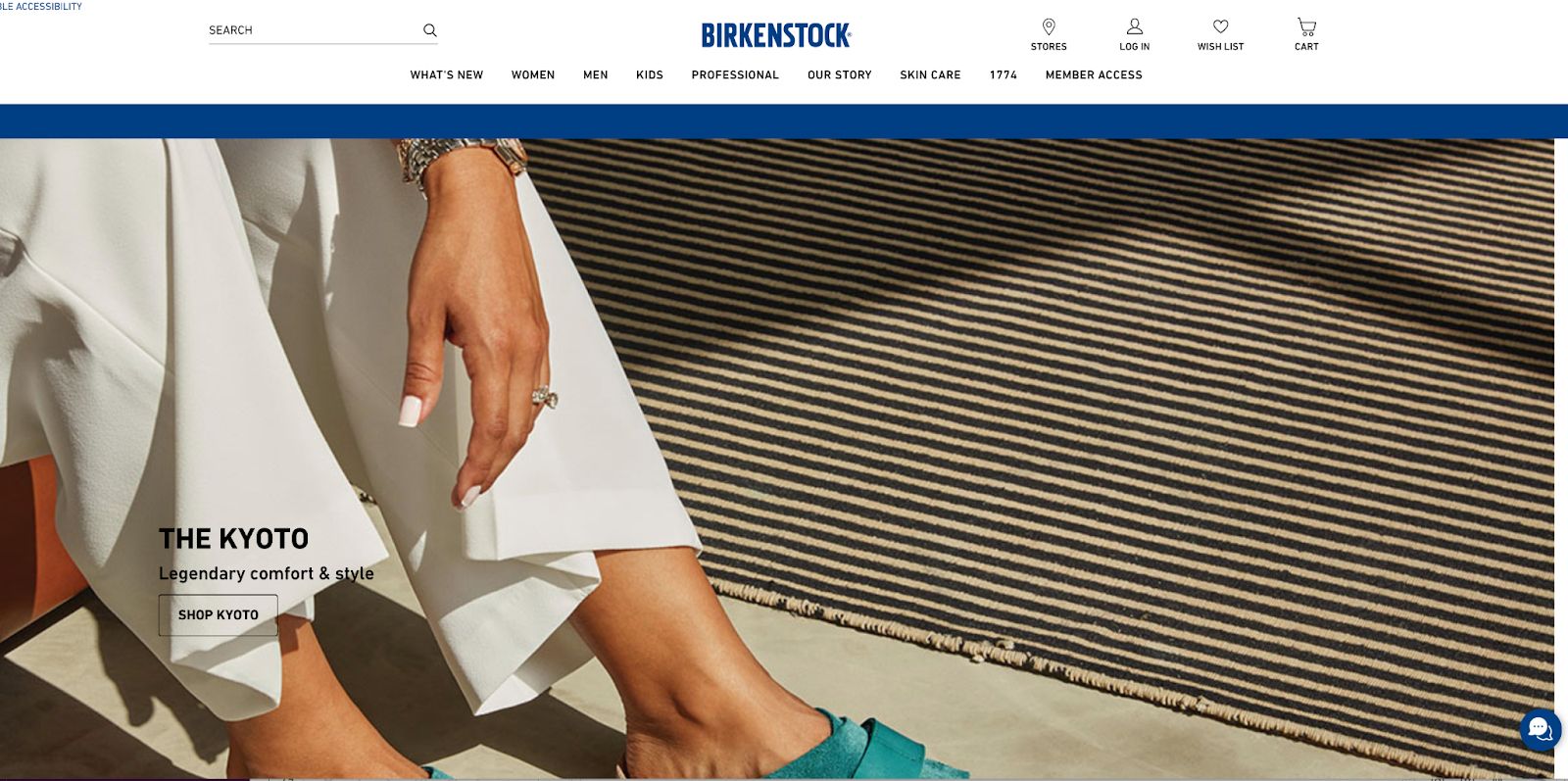
- Create Visual Chaos. Don’t use old, hard-to-read fonts or a lot of colors. Today’s websites are more minimal. See Birkenstock’s minimalistic approach.

2. Use Strong Images
The images you choose for your homepage matter. Visuals get people’s attention first, so you want to make sure the photos you choose are appealing and represent your brand well.
When choosing images, do:
- Differentiate. Great visuals draw people in. So make sure your photos and graphics set you apart from competitors. Also, remember that less is more.
- Make a Statement. Give your pictures room to breathe on the page by allowing for a lot of white space around them. Also, make a statement with your images. Make sure they’re gorgeous, big, and bold.
- Use a Pro. Use a professional photographer for all photos, including product and ambiance shots. It will be a worthwhile investment.
- Show Behind-the-Scenes. Visitors connect with people and like to see what goes on behind the scenes. Your business has a unique approach to doing business. Show it off in your photos.
When choosing images, don’t:
- Use Stock. Don’t use stock photos. Visitors might have already seen them on other business websites. They seem unreal and make-believe. The trust factor will decline.
- Forget Captions. Don’t forget the photo credit and caption for each photo. They say a picture is worth 1,000 words. It’s only true if the viewer can identify the context in which it appears.
- Post As-Is. Don’t use image files that are too big. They slow load times on your website, causing you to lose visitors before they see your homepage. Be sure to compress your photos when you upload them onto the site.

3. Follow a Hierarchy
You want your visitors’ eyes to know where to focus on your homepage. A creative hierarchy gives every design element a visually appealing space and makes sure it has a purpose on the page. If you don’t need it, leave it off.
When following a creative hierarchy, do:
- Make It Obvious. People won’t know what’s wrong with a visually chaotic page. They can’t put words to it, but they know it feels cluttered. So make sure visitors can distinguish the essential visual elements from the supporting elements.
- Use Contrast. Make sure the relationship between the background and overall color scheme work well together. For example, darker text and elements on a light background work best.
- Feature Elements. Make sure essential elements on the page stand out. For example, you want the call-to-action to be noticeable.
- Decorate. Use colors and fonts to show visitors the path through the homepage. Each decorative element should have a supporting role for the primary purpose of your site.
When following a creative hierarchy, don’t:
- Use Too Many Colors. Don’t overburden your homepage with too many colors. Don’t use colors that don’t go well together.
- Distract Visitors. Don’t distract your visitors with competing visual design elements. Size items differently, according to their importance on the page.
4. Focus on Your Call-to-Action
The CTA is what you want visitors to do as a result of visiting your site. Therefore, you want to make sure it’s easy for them to see and understand.
When designing your CTA, do:
- Put It Up Top. Place a quick, engaging CTA at the top of the screen on your homepage. Putting it at the top allows visitors to see it, regardless of the size of screen they’re using.
- Vary It. You want visitors to notice and receive your CTA without beating them over the head with it. Create different versions of your CTA with slightly different wording and design.
- Measure Effectiveness. Use A/B testing to measure your CTA’s effectiveness. Only 17% of marketers use A/B testing to maximize conversion rates. You can beat your competition easily.

When designing your CTA, don’t:
- Confuse Visitors. Nothing makes people bounce off of your site faster than competing, conflicting, and confusing CTAs. Keep them consistent.
- Bury CTAs. Don’t make your visitors hunt for a clear indication of what you want them to do next. Make the CTAs easy to find and obvious.
- Distract. Don’t use distracting links that guide visitors away from your site’s primary purpose. The conversion rate increases when you remove links from your CTA and keep it to one action only.
A successful homepage is all about lead generation and conversion. Read more about these trends in ecommerce >>
5. Update Content Regularly
You want your site to be a resource for visitors. That’s why you’re making a homepage in the first place. When it comes to content, regular, consistent posting is key.
When working with content, do:
- Keep It Fresh. Visitors will check for a blog and recent content. Make sure there’s something new for them to see on a regular rotation. Content updates aren’t just for your visitors. Google also ranks content depending on freshness and relevance for specific keywords.
- Optimize for Search. Research the keywords for your content and incorporate essential search engine optimization tools when publishing new content.
- Package. Support your content with clear headlines and great visuals.
- Keep It Simple. Visitors are busy and are likely to scan your site instead of reading it. Apply bullet points to lists and keep your sentences concise.
- Use Multimedia. Publish graphics and videos that contribute to understanding your services or products. They also will capture visitors’ attention.
When working with content, don’t:
- Write Long. Don’t produce tons of text. Again, your visitors are more likely to scan than read. They certainly don’t want to read an essay. Break up your text with visuals, subheads, and lists to make it easy for them to consume on the go. Visitors hate walls of text that go on and on. You only have 10 seconds to keep your audience’s attention.
- Skip Proofreading. The text on your site also adds to or distracts from your credibility. Be sure to use good grammar, spell check, and proofread.
Make a Successful Homepage with Nexcess
In a world of 30 distractions per second, your job in making a homepage is to give a quick insight into your business, product, or services. You only have a few seconds to make a first impression and build trust.
At Nexcess, we know ecommerce in and out. Our StoreBuilder app is your guide to make a successful homepage. Get started now.

