
While beauty may be in the eye of the beholder, when it comes to websites, following good website design tips can ensure your site is both attractive and better optimized for conversion.
When a visitor first lands on a website, they’ll decide if they want to stay or bounce within a fraction of a second. Utilizing the best web design tips ensures a website is visually appealing enough to capture visitors’ attention.
Before the internet, business owners relied on storefronts to capture customers’ attention. Today, most businesses aren’t finding new customers because they saw their window display while strolling down main street.
The web is buyers’ first stop for information, and your website is the most likely first touchpoint a customer will have with your brand. Trends in web design come and go, but these tips will always apply.
Implement the following good website design tips to ensure your site is making an excellent first impression.
1. Ensure Your Website Aligns with Your Brand
Establishing brand continuity is one of the best tips for web design. A site’s colors, fonts, and images should match the company’s overall brand identity. Your website should be instantly recognizable as an extension of your brand.
Most people find websites through a search engine instead of directly typing the URL into their browser. If someone clicks to your site from search results and the site looks nothing like your brand, they might think they’ve landed in the wrong place or have encountered an imposter site.
The design of your website should leave visitors confident they’ve landed in the right place. If something looks off, such as the website logo not matching the logo used in your stores or on your business cards, visitors might become confused or suspicious.
When poor branding and design put a seed of doubt in visitors’ minds, they’ll be less likely to submit their information or make a purchase on your website.

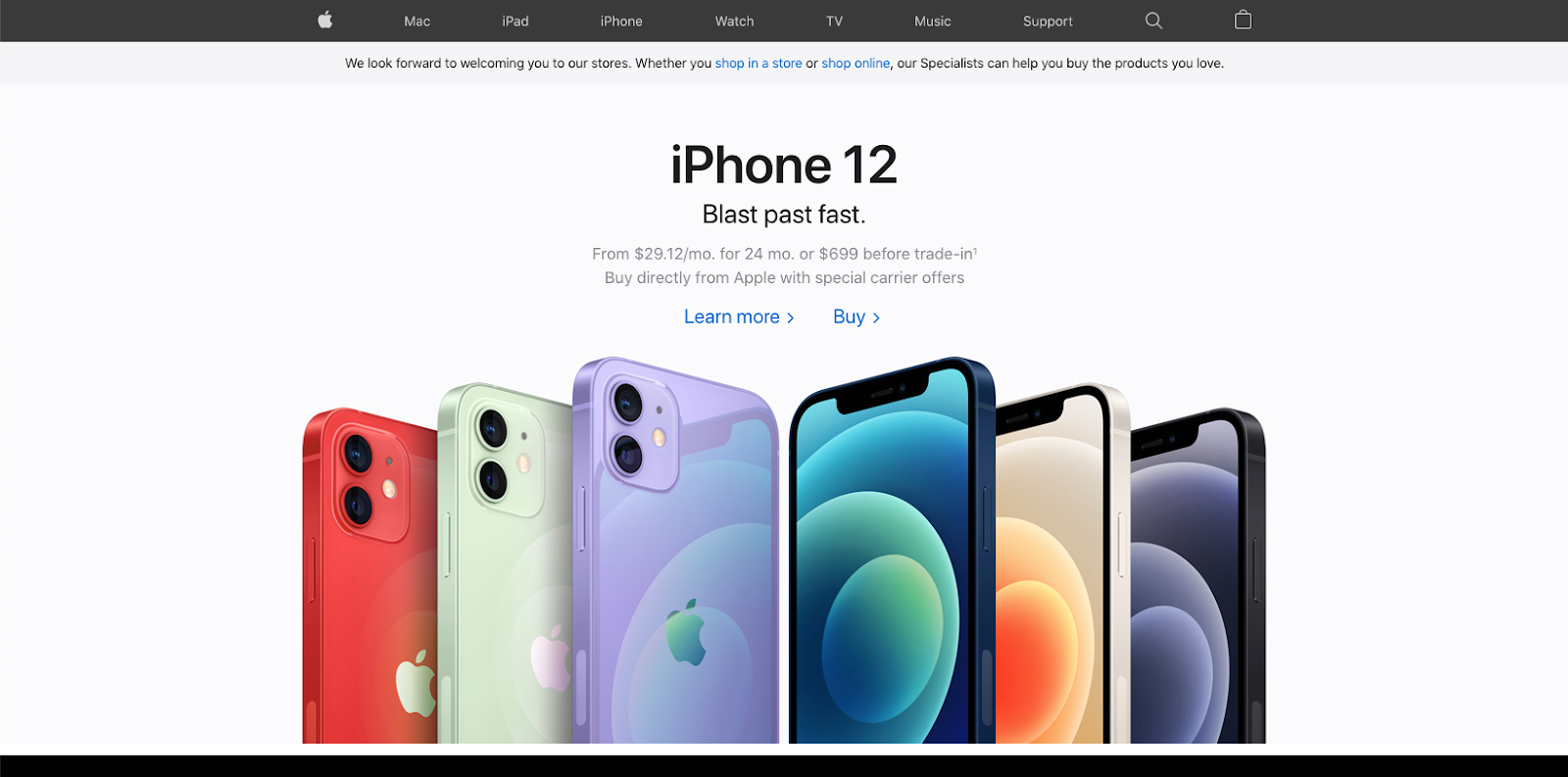
Apple’s clean and minimalist web design matches the aesthetics of its brand.
2. Keep It Simple
Simplicity is the key to good website design. People are easily overwhelmed when presented with too many choices. Psychologists refer to this concept as the paradox of choice whereby presenting someone with an overabundance of options paralyzes them from making any choice at all.
For example, in one study, researchers conducted two jam tasting sessions at a grocery store. In one session, shoppers could pick from 24 flavors. The other session offered only six flavors.
While the session with 24 flavors attracted more people, most of them didn’t make a purchase. Only 3 percent of the people who tasted the jams made a purchase. On the other hand, nearly one-third of the people who stopped at the table with six flavor choices made a purchase. The conversion rate for the simpler design was ten times greater than the more complicated tasting setup.
The key takeaway, especially for top ecommerce sites, is to keep your design and navigation simple to increase your conversions.

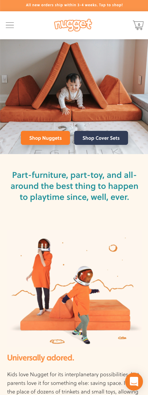
Simple designs are best, especially on mobile devices.
3. Leave the Sliders and Carousels Out of Your Design
Sliders used to be incredibly popular, but there’s a reason you don’t see them used as often in modern web design. While the movement seems to add an interesting visual element to your homepage, ultimately, sliders aren’t effective.
As a general rule, if you want someone to see and read something, don’t put it in a slider. Often by the time a page fully loads, the slider has moved on to the second or third image. Visitors can easily miss the first slide. Most people aren’t going to stop and wait for a slider to progress through each slide so they can take in the information. Conditioned for urgency, people will scroll right past it.
The movement of a slider also often resembles an ad making your visitors even more likely to ignore it. Instead, use your design and copy elements to encourage people to keep scrolling or clicking deeper into your website instead of expecting them to sit through a slideshow.

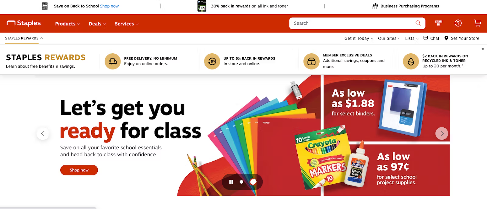
Sliders like this one make it easy for visitors to miss important information. Staples.com
4. Avoid Stock Photos
Stock photos are cheesy. When you look at some of the best homepage examples, the thing that stands out is the quality of the photography. Your photography needs to be unique to your brand and company. Stock photos look too generic. Companies struggle to differentiate themselves when they’re using the same stock images as all of their competitors.
People can tell when you’re using stock photos. They know not all of your employees are smiling with airbrushed white teeth waiting to answer the phone. In one experiment, a company tested two landing pages. One page featured a stock photo of a smiling woman. The other page featured a picture of the company’s founder.
While the smiling woman looked more polished, people could tell the image wasn’t authentic. Visitors were 35 percent more likely to sign up for a consultation when landing on the page with the owner’s photo.
Investing in a professional photographer to take shots of your products and staff can improve your website design.


5. Use Social Proof
Adding social proof elements to your website is one of the more frequently overlooked tips for website design. Especially if you have a one-page website or are working on creating a homepage, you need to include social proof in your design.
If you remember the old commercials where “four out of five dentists recommend Trident gum,” you’re familiar with social proof. Social proof is backing up your marketing claims with feedback from third parties.
Examples of social proof include:
- Customer reviews
- Ratings
- Certifications
- Celebrity or expert endorsements
People are naturally suspicious of anyone trying to sell them something. Social proof alleviates customer’s concerns because it shows other people purchased and liked the product or service. Product ratings are another example of social proof. So when you’re using an ecommerce website builder, be sure to include product ratings and reviews in your design.

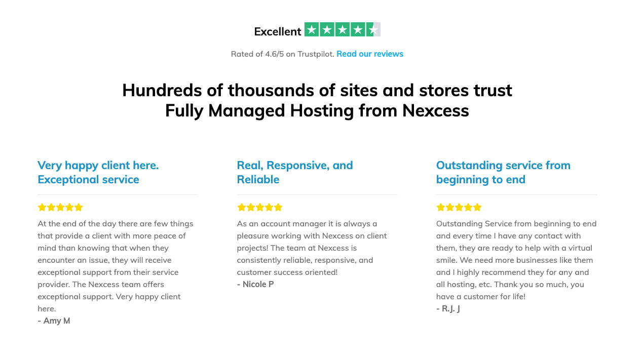
An example of social proof from the Nexcess homepage. Nexcess.com
6. Make Your Design Functional and Accessible
One of the most essential web design principles is to ensure your design is functional and accessible for everyone and every device. Don’t make the mistake of only designing your site for the large monitor on your desk. Most of your traffic probably comes from mobile devices.
When you’re building a responsive website, design for mobile-first and think about how the site will scale up to desktop sizes. Whether you’re just learning how to build an ecommerce website or you’re seasoned, you probably know that mobile optimization is crucial, as the majority of ecommerce transactions occur on mobile. Thus, optimizing for mobile is one of the top ecommerce website best practices.
A common problem is with buttons and popups. Make sure when your site scales down for a mobile screen, the buttons are still large enough for someone to click. Popups often present a challenge if the popup content is so large it bleeds off the mobile screen and prevents users from exiting.
In addition to optimizing for mobile, you’ll also need to make sure your site is accessible for people with disabilities. Tools like accessiBi make sure your site is compliant with accessibility regulations, and people can use screen-readers and keyboard navigation on your site.

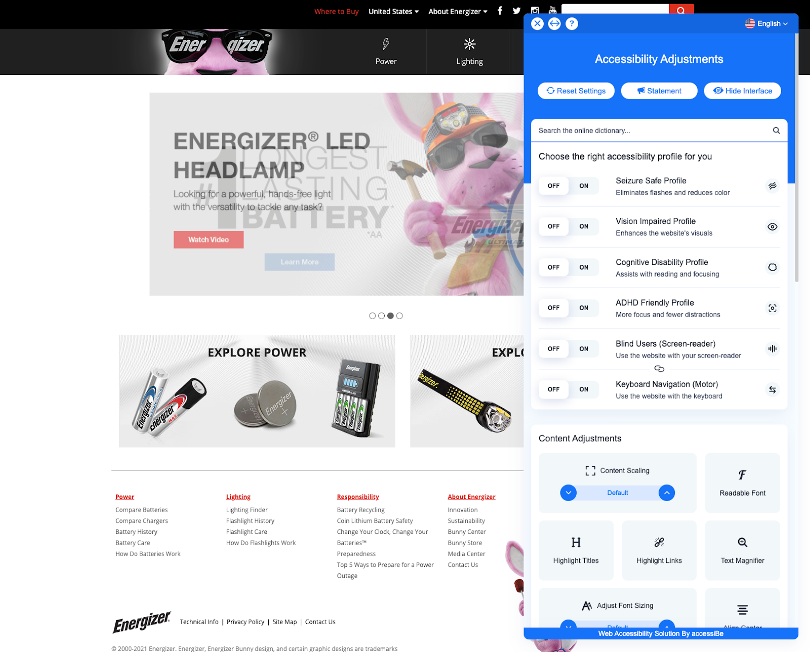
An example of accessibility options. Energizer.com
Putting These Good Website Design Tips to Work
When designing a website, you’ll want to follow the best practices in this guide to ensure your site delivers results. If you follow these website tips and keep your design simple, clean, and functional, you will be on the right track to web success.
If you’re launching a new online store and need help with the latest ecommerce trends, consider using the Nexcess StoreBuilder to get your site up and running fast without the need for a developer.

