 Calls to action are the pointy end of the conversion optimization process. They’re the make or break element that can mean the difference between a sale or signup and a “maybe not.” Your website is a machine for creating sales and conversions. It doesn’t matter whether it’s a blog, a eCommerce store, or a lead generation site, calls to action are an essential part of making the visitor do something that goes beyond passive content consumption and browsing.
Calls to action are, for the most part, common sense, which is why it’s surprising that so many websites either don’t include them at all or do them badly. In this article, I’d like to take a look at a few tips to turn turgid CTAs into the razor’s edge of an effective conversion machine.
Get The Language Right
Calls to action are a special type of web copy. They are not product descriptions, they are not boilerplate, and they are not a chance to show off creative writing chops. They have one purpose: get the user to click on a link or button and thereafter carry out an action. The language you use can make all the difference.
Active Snappy Language
Compare these two examples:
“Would you like to receive our high-quality ebook about marketing optimization written by some of the most experienced marketers in the world. If you’d like to learn the secrets of marketing optimization, click here”
“Get our ebook now to learn how experts optimize marketing strategy.”
In the first example, the reader has probably fallen asleep by the time they get to the meat of the proposition. The best CTAs use snappy active language that gets to the point immediately. The shorter the better: our brains process language in chunks, and we want readers to be able to absorb and comprehend our CTA in the shortest time possible.
Offer Incentives
A key question to ask yourself when designing calls to action is “what’s in it for the user?” You know why you want them to click through, but you need to provide some incentive for the user; that can be a valuable piece of content, a promotional price, or an opportunity to feel good about themselves (social proof), depending on the product, but you must offer the user something that makes them want what you have to offer.
Demonstrate Scarcity
People are incentivized by scarcity: is the offer you’re making available for a limited time? is it only available to a fixed number of users? Many web service startups take advantage of this effect: that’s why they’ll only let a small number of people onto betas — they want to create the impression that they’re offering something rare and that the user would be missing out unless they click.
Attention Is Key
This might seem obvious, but the key to a successful CTA is attracting the attention of the user. Your calls to action should be the most prominent feature on the page, but they should not be so obnoxiously attention grabbing that they prevent the user from following their own agenda on your page: so no content blocking pop-overs that appear as soon as a page loads.
Positioning
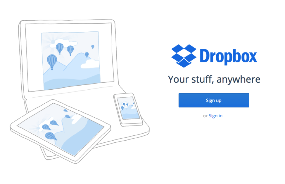
CTAs should be given a prominent and central position that draws the attention of the user. Other page elements, including white space, graphics, and copy should subtly focus attention on the CTA. I say subtly because I don’t mean neon colors and flashing text or a huge arrow pointing at the CTA. It’s often enough to isolate the CTA with white space, as this example from Dropbox shows.

Parsimony
Choice is good, too much choice is bad. The point of a CTA is narrowly focus the user’s attention on a single proposition. Multiple CTAs are antithetical and can reduce conversion rates. I don’t just mean that conversions will be split between the calls to action, but that overall conversions will decline if users are offered too many options at the same time. Each page on your site should have one job, and it should be embodied in a single visible CTA.
Of course, there’s nothing wrong with having a CTA at the top of the page, and another at the bottom of a blog article, just make sure that users are constantly bombarded with multiple options.
If you stick to these basic principles, your calls to action will be much more effective.

