While the data tells us that many sites are seeing more mobile traffic than desktop traffic, conversions on mobile devices still lag far behind. So people are using their phones more but they use a computer to actually make the purchase which is a point of friction.
Today we’re going to look at some things you can do to make it easy for mobile users to convert to paying customers on your WooCommerce store. As you try these suggestions, remember to A/B test them for your site. Just because they worked for others doesn’t mean that they’ll have a positive impact on your particular checkout process.
Make Form Fields Easy
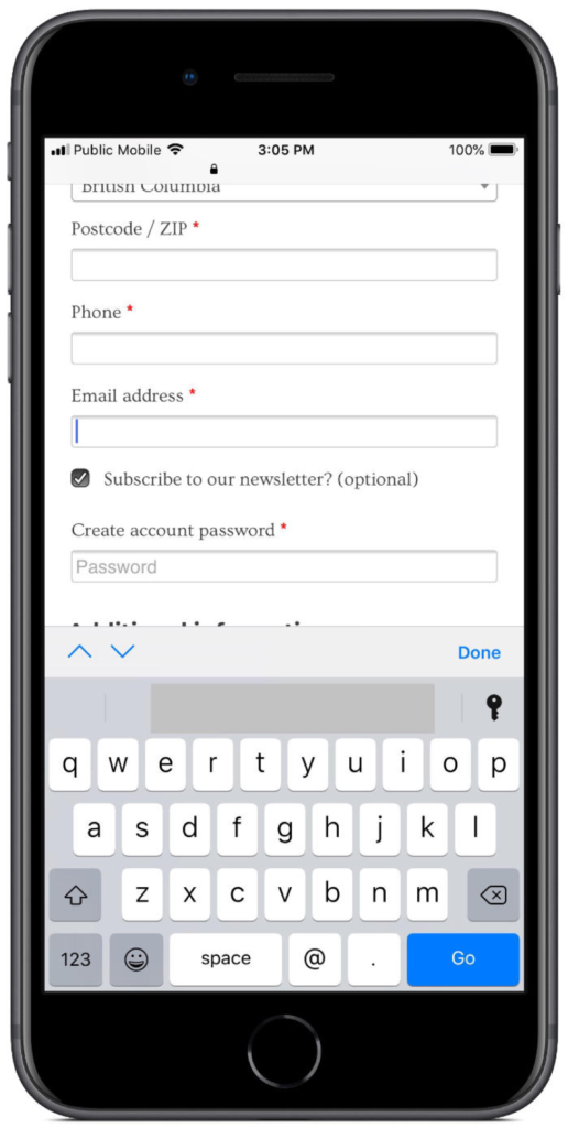
Mobile devices have this great thing called a software keyboard. That means that if we accurately identify our form fields, mobile users will be presented with a keyboard that’s appropriate to the data that needs to be entered.

As you can see above, WooCommerce does this by default when it identifies an email field. To make it easier to enter my email, the @ symbol is readily accessible, rather than being hidden behind another set of keys.
Other fields to review are the Zip/Postal Code and Phone fields. If you want these fields in a particular format, it’s best to pre-program the format, rather than leave it up to the user. More than once, my checkout has been denied because one of the fields was incorrectly formatted. It’s already annoying having to switch back and forth between letters and numbers on a phone keyboard. So, don’t frustrate your users further by forcing them to enter the data you want in an exact format.
Your users should never have to deal with this. Take the time to write some JavaScript to format the field how you want after they’re done typing, or handle the formatting server side. Any other option is putting an extra burden on your user, making them less likely to purchase.
Format Field Errors Well
Have you ever clicked “checkout” after wading through form fields only to be greeted by a stack of errors the site says you made? WooCommerce is just as guilty of making users hunt for issues with their checkout information just as any other platform out there.
Sure, they provide that little red * beside required fields, but if you miss one, all you’re going to get is a big red box at the top of the page. You’re on your own to hunt down the issue with the notification provided.

There are better approaches to this system, with my favorite being validating the fields as you enter them. Don’t make the user wait, show them right away if the field is right or not.
The second option I like is showing the field errors directly inline. That means when you have an error, highlight the field in red and explain what the issue is in the same view. If you want to implement this, Business Bloomer has a great tutorial on adding errors inline with WooCommerce fields. I’ve used this on a few client sites and have been very happy with the results.
Don’t Hide your Checkout with Notifications
While you may be able to get away with some upsell tactics on a desktop checkout experience, it’s far too easy to ruin a mobile checkout experience. Touch targets are often far too small, and sometimes even off-screen when popups display on mobile devices.

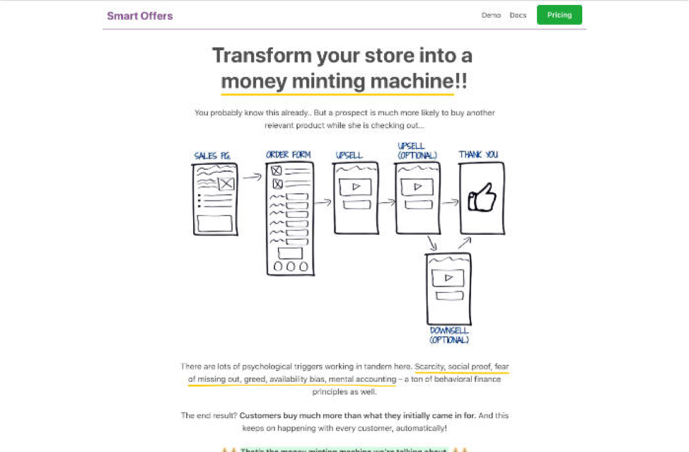
Instead of popups or other visual clutter, look at Smart Offers to increase your total order value. Rather than asking a user to add something to their cart before they’ve made a purchase, Smart Offers asks them after they’ve completed their initial checkout action.
Check Reachability
Research exists on how users interact with their phones, but I have yet to find anything on how gender affects phone interaction. This is a critical gap in research since women, in general, have smaller hands than men, potentially affecting reachability.
Since programmers are overwhelmingly male, this means that the people building online stores aren’t testing the reachability of their interfaces for 50% of the population.
Testing how people interact with your checkout form is crucial to ensuring that you have solid conversions. But, don’t fall into the trap of only testing with those that are convenient. Make sure that you put effort into testing across a broad spectrum of hand size and device size.
With one client, there was pushback on tweaking the checkout for smaller hands because they didn’t have a broad base of female customers that purchased on mobile. I convinced them to make a few small tweaks to help make the checkout process better for smaller hands, and within a few weeks, we saw an increase in the purchasing by female customers from their mobile devices. We didn’t see female customers before, because the checkout wasn’t built with them in mind.
Site Speed
Another consideration you need to take into account for mobile checkout is understanding site speed in the context of where your target market is. While users in cities will get 4G speeds, rural users may only have 3G connections and severely limited data plans.
Even looking at the countries you are targeting can mean you need to think about different things in terms of site speed. In Canada, we have decent speeds, but anemic data plans compared to many other places in the world.
When you’re developing your mobile checkout experience, make sure you test it on throttled internet connections. It’s fairly easy in Firefox and Chrome.

If you’re testing on Safari, then you’re going to have to look at a 3rd party tool like Charles Proxy or install the Network Link Conditioner tool for xCode to simulate slower connections. You can even use this tool in conjunction with your iOS test device to throttle the live connection as you test your site on a properly mobile device instead of a simulated one in the browser.
Make sure you test your site against the slow connections that your users may have, instead of checking only against the connection you have at work.
Visible Trust Marks
A trust mark is an image from your SSL provider or some other icon that shows you have a secure and trustworthy payment provider. Often these are relegated to the bottom of a site for desktop users, but it’s worth reevaluating where you put them for your mobile layout.
For one client I worked with, we experimented with putting them right at the top of the checkout. That way, when the user came to the checkout on their phone, the first thing they saw was the small marks that said we had a secure site without malware on it. This small change produced a 1 – 2% increase in conversions, which adds up to a bunch of extra earnings over the year.
Password Filling Applications
One of the final ways to help increase users completing your mobile checkout process is to make sure that any user account fields work with tools like 1Password, Dashlane, and LastPass.
Passwords are enough of a pain sitting in front of a full keyboard, but they get even worse when you enforce secure passwords that require switching back and forth between the different keyboards.

Testing this is fairly easy; Grab a free copy of all the above tools and put your password into them. Then, try to checkout using them to fill in any passwords or user fields that are in your checkout form. Don’t forget to use each of these applications to create an account at checkout as well.
Possibly the worst mistake you can make here is blocking the ability to copy and paste passwords into your account fields. This is how password applications work, and any user that is creating secure passwords is highly likely to leave once they see they can’t add their nice long random password in without manually typing it.
Building a good checkout process is crucial to having a profitable eCommerce site. With the rise in mobile purchasing, it’s even more important to make sure that you provide a top-notch experience to mobile purchasers.
By working through the steps here, you can make sure that you do provide an excellent experience for your mobile users. They’ll be happy, and you’ll convert more purchases, which makes you happy.
Build a High-Performing WooCommerce Store
Create a store that converts traffic with Nexcess’ Managed WooCommerce hosting solutions. They come standard with Jilt to help you recover abandoned carts, performance tests whenever you need them, and the platform reduces query loads by 95%, leading to a faster store.

