

Nowhere does your website design and user experience impact sales more than on your product pages. They’re the digital “display cases” that present your products in their best light, motivating shoppers to press the “Add to Cart” button. Effective product pages are beautiful, informative, and streamlined. They also express your unique brand.
There’s no reason to reinvent the wheel when it comes to (re)designing your WooCommerce product pages. Instead, get design inspiration from store owners with exceptional strategies. Then take advantage of the ability to customize WooCommerce product pages. Here are five inspiring, customized WooCommerce product pages along with the plugins, tools, and tips to get started today.
Improve Your Product Images
Your product copy may be on point, but if your pics are off, sales will suffer. Your product images sell more than you ever could with flowery prose. Put enough resources into getting the highest-quality imagery you can, which might require hiring a professional photographer.
One WooCommerce site that gets their images right is the large format printer Gorilla Printing. The company’s product pages present their signs, screens, and banners from different angles and contexts. The more ways a customer can view a product, the more confident they’ll feel in making the purchase.

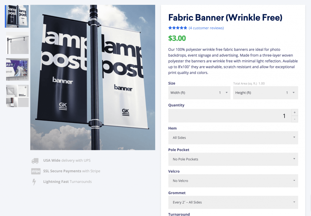
Gorilla Printing uses the standard product thumbnail navigation sidebar that comes standard with WooCommerce templates like Storefront. Although the sidebar isn’t customized, their designers choose good secondary images that show multiple views of products, hardware accessories, positioning, and hanging options.
Image swap plugins can display a secondary product image when the user hovers over your product on a category or other taxonomy page (such as showing the back of a t-shirt when the user hovers on the image). If you want to forego plugins and take a more customized approach, there’s also custom coding for rollover image swap as well.
Make sure to capture images with enough resolution to show your product details. But remember: High-res images are large files. They can slow your page-load speeds. Avoid this by optimizing your product page images.
Improve Your Product Description
If you’re into finely crafted cocktail tonics and equally potent product descriptions, look no further than Jack Rudy Cocktail Co.

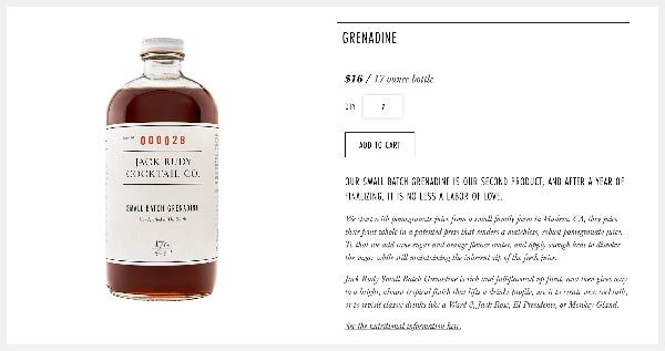
Effective product descriptions include a short and long section. The short blurb is for quick page scans, while the longer section goes more in depth. The Jack Rudy Small Batch Grenadine product page is a good example of this two-part approach.
The short description provides helpful, relevant information: “Our small batch grenadine is our second product”. Next, the ending adds some brand flair—“labor of love”—to suggest the company’s passion and craftsmanship.
The longer section follows providing relevant facts about the product’s production and adding an enticing description of their grenadine’s taste profile — using strong, evocative language like “full-flavored”, “bright”, and “tropical finish”.
In your product descriptions, tell a story about your product that goes above and beyond its basic features. Jack Rudy’s product descriptions illustrate how to convey branding on your product page—how to personalize your company so shoppers feel more comfortable buying from you. Eliciting positive feelings at the point of sale is a powerful way to boost sales.
Test Your Pricing Placement
The first two steps of the shopper’s search on a product page typically goes like this: “Is this what I’m looking for?” and then “Can I afford this?” If your product prices don’t jump out at shoppers, you’re frustrating them early on. You’re putting up an unnecessary obstacle on their mission to buy. Don’t lose sales because of this simple design flaw.
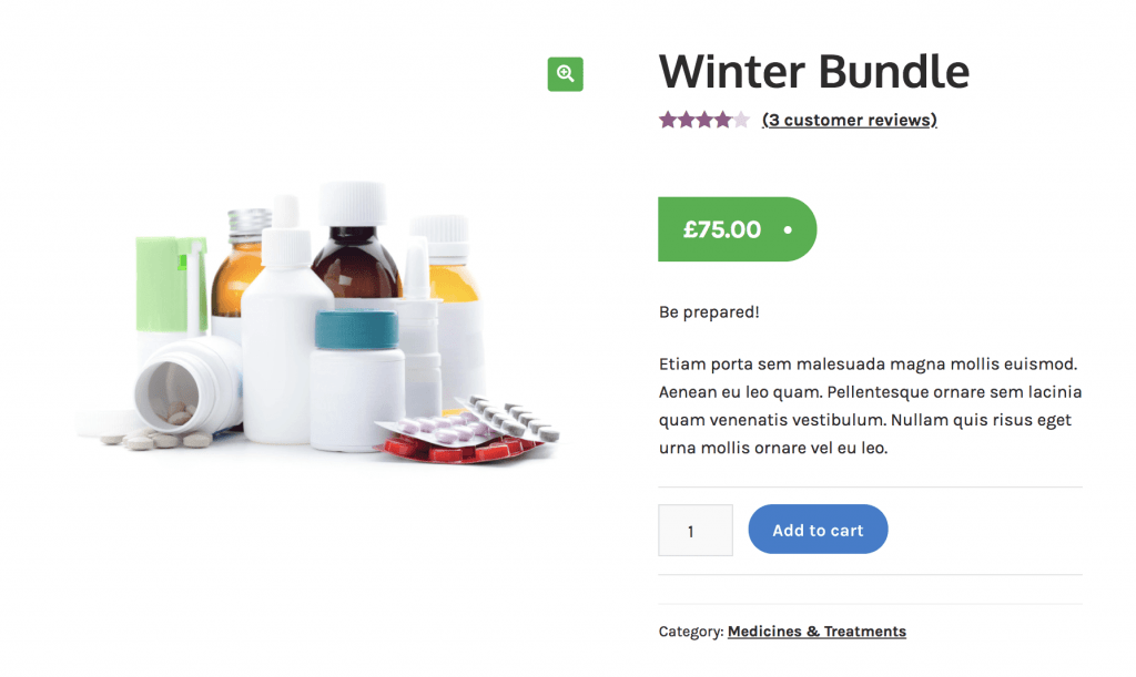
Many WooCommerce themes place the price next to the product title, near the top of the page, and on the right side—a location that aligns best with how we actually scan a website—and looks comparable to most other eCommerce websites.

Pricing example from Pharmacy child theme for Storefront
Best practices also say that if you want to make it easier for the user to quickly understand the price, you can customize WooCommerce product pages so that:
- The price is displayed in a larger font size
- Text is bolded
- Font color is highly visible
All three are relatively easy CSS changes on most websites.
But, some online retailers like Osana have taken an extra step in formatting their pricing. Osana—a company that sells mosquito repellent soap— uses custom boxes to help users instantly see how buying a 4-pack of soap vs. a quarterly subscription saves them money. Most default themes would use a drop-down selector to change units, boxes, etc., and make the customer explore that drop-down in order to understand the pricing options. Here, every available option and its corresponding price are already listed.

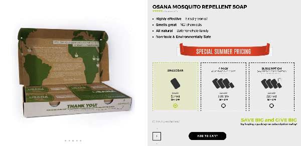
To help the customer even more, Osana adds an icon to the pricing pack. The icon, in conjunction with the product title, quickly communicate what product is being selected. As if that’s not enough, they also include radio buttons and a yellow highlight feature to show which product choice is currently ready to be added to their cart.
For a business that earns better customer lifetime values from bulk orders and subscriptions, dedicating time to testing and designing custom layouts will help raise their conversion rates.
Sell your products online, worry-free
Officially recommended by WooCommerce, our hosting is made for online businesses like yours
Spend More Time on Related Product Recommendations
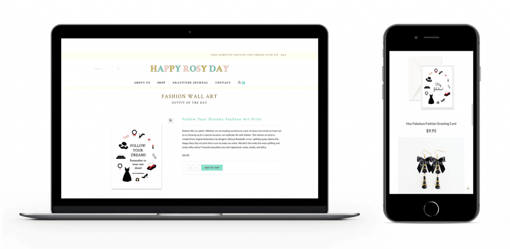
Designer and author Zakiyya Rosebelle is the founder of Happy Rosy Day, an online stationery and journal purveyor based in San Francisco. Smart store owners like Rosebelle use the “Related products” feature on their product pages to up-sell or cross-sell customers. The “people-also-bought” strategy of upselling is mastered by mega-companies like Amazon, but smaller stores like Happy Rosy Day can deploy them just as effectively.

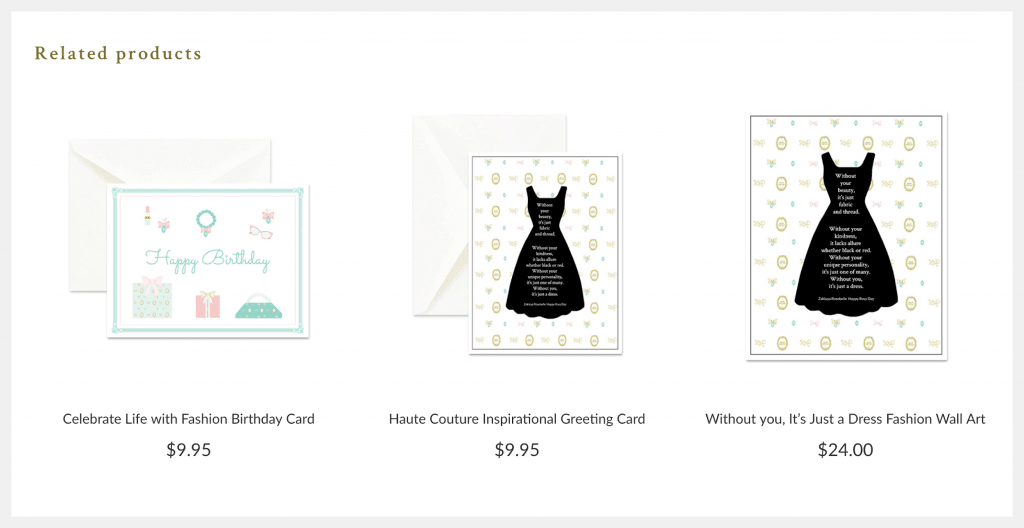
Happy Rosy Day takes a minimalist approach to page design. Pages have a clean, white background, minimal text, and a simple related product layout. “I have discovered that a clean, simple, and responsive product page is the most effective,” says Rosebelle. “I design my product pages so they are very simple and easy to use, yet they are beautifully branded and optimized.”

Rosebelle chooses to list three related products on her customized WooCommerce product page—a good number for scanning the page horizontally (desktop) or vertically (mobile). The images are beautiful and related to the main product. Don’t annoy shoppers with products that don’t relate to their search history. Also, when deciding on the number of products that appear, avoid giving customers too many choices.
Some product page templates automatically pull products with similar tags or categories into your related products section. By adding specific products to categories or giving them tags, you can influence what related items are presented.
You can also manually relate items as up-sells or cross-sells. Up-sells are similar items—of higher quality and price—that you can recommend to customers on your product page. Cross-sells are complimentary items a shopper might be interested in after purchasing the product. For example, after a customer adds a mountain bike to their shopping cart on a sporting goods site, they get cross-sell offers on a bike helmet, riding gloves, and bike lock.
Both up-sell and cross-sell settings give you more power to guide the shopper to make a purchase. Consider using them when setting up your related products on WooCommerce.
Check Your Page Layout
A good product page layout has elements that work as a whole, not randomly placed where there’s room. Pages have two basic sections: “above-the-fold” content—what is visible when the page loads—and “below-the-fold” content— what the shopper must scroll down to see.
Above-the-fold content makes the sale, while below the fold content is supplemental and adds value, like social proof or suggested products. Include all the information a shopper needs for an immediate purchase above the fold, such as:
- Product image
- Product title
- Description
- “Add to cart” button
- Size, color, and quantity selector
The skin care site ScrubzBody sports a product page layout that’s ideal for any eCommerce site. Founder Roberta Perry explains how their research influenced the site’s design:
“First we did customer surveys. Then we did heat maps. The biggest thing we changed was the menus. We had a drop-down then side-out menu type. I had too many subheads across the top. We went to a Mega Menu setup and adjusted so that things were in the places people were looking for them… we used the Anthem Child Theme for Divi with WooCommerce as our eCommerce. I love the flexibility, and I can make changes and additions with ease.”

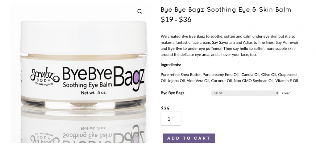
ScrubzBody’s above-the-fold layout includes the product title near the top. Nearby, the price is clearly visible. The description and ingredients sections are separate sections, helping the shopper find the information they need. And the “Add to Cart” button stands out in the company’s purple-branded color, next to the product image.
Perry’s page also includes a mouseover zoom effect to give customers a more detailed look at products. Traditional “lightbox” quick view features require opening a popup for closer inspection.
Some customers may not understand the click-to-zoom interface required. However, mouseover zooms invite customers to examine your products by simply moving their pointer.

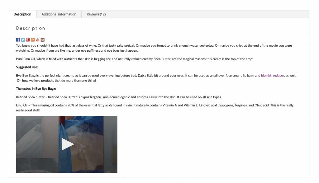
Below the fold, Perry includes a custom product tab section with more product information, an instructional video, and some customer reviews. Tabbed content areas like these offer customers valuable information in a compact form—no need for them to endlessly scroll while using the site’s mobile version.
The ScrubzBody product page layout works well because its designers take advantage of helpful WooCommerce plugins, follow best webpage design practices, and provide customers enough information to feel confident buying.
Before You Start Writing New Code
Before you start shifting things around on your product page, take a few moments to gather some useful data to help inform your design choices. No need to change things that are working.
Heat Maps
Website feedback tools like Hotjar give you data on how visitors interact with your page. You’ll be able to see what specific page elements shoppers are clicking on the most and the least. You may find they’re clicking on a word or image expecting a link when none exists.
See What Amazon’s Doing
Online retailers like Amazon, Walmart, and Kohl’s set the standard for online shopping, and have designed every digital inch of their websites for maximum effect. As a result, their customers come to expect specific layouts, elements, and experiences from a product page. Mimic the look and feel of these retail giants. Include common features like variation swatches so customers can see your products in different colors, patterns, and materials.
Backup and Test Your Site
Don’t waste your time and money. Backup your wp-content folder and WordPress database before making changes to your product pages. If something goes wrong, you can at least go back to previous versions. Also, you don’t want to waste your design changes because they conflict with WordPress or plugin updates. Create a staging copy of your website to test its functionality before pushing it live.
Product images, descriptions, and price placement can often be pushed down the ladder of priorities when managing your online store. But “small” design elements like these have big implications for sales. By taking the time to fine-tune your eCommerce site, you’re showing your customers that you’re taking that extra step to make their shopping experience exceptional. They’ll reward you with more sales. But don’t stop with just these design suggestions. There are plenty of other design elements to optimize for your WooCommerce site.
Ready to Take Your Store to the Next Level?
We’ve built a high-performance platform capable of radically helping your store’s load time while handling heavy traffic loads with ease. Our platform comes standard with Jilt, so you can start recovering abandoned carts immediately and regaining lost sales.
Learn more about our Managed WooCommerce plans.

